

cTune v1.0: Part 3 - Frontstage
Table of Contents
ctune is Linux based internet radio stream player for the console entirely written in C. It uses the RadioBrowser API as a source for searching streams and getting station information.
This is part 3 of 3 blog posts detailing the process of designing and implementing cTune's frontend (UI).
The wireframes and UI graphics are made with Pencil and, the UML diagrams, with PlantUML.
1. Design
1.1 Wireframes
1.1.1 Main window
The first question was "What information should always be present in the main window?". The answer is refreshingly limited in scope:
- visual queues to access the distinct data categories (i.e.: what the application can offer)
- the volume,
- station playing/queued and song title
- indicator to show if the station is playing or not,
- error messages (lifetime at least until the next operator action)
- the name of the application and the current version (not strictly required but nice to have nonetheless).
And so the data categories (search results, browser, bookmarked favourites) were placed as tabs and the rest placed on the edges of the main UI space:
- a title bar for the application name/version,
- a status bar for the play state, current station/song descriptions and volume,
- a message bar for the a description of any error spawned from the depth of the application.

1.1.2 Station lists

The application revolves around showing lists of radio stations so the next item to look at was just that. These lists will be in all 3 of the tabs in some form or other: favourites, search results, browse listings.
Essentially each item in a station list represents a RadioStationInfo DTO but these contain a lot of fields that cannot all be shown in the item. Only the most important fields that convey enough information to make a choice should be shown. After some musing the following were chosen:
- Name of the station,
- Bitrate
- Country indicator (country code)
- Category tags
Putting each in a corner requires 2 lines of text + a delimiter for every list-item but, as I wanted some options for real-estate-challenged terminal windows, an alternative "compact" version of the list-item template was additionally added to the design (see wireframe 2).
1.1.3 Sub-listings browsing with a "SlideMenu"

The "Browser" tab was to be the only one with a different layout. Though, the first design iteration involved using a dialog for the category selection which would then open a new dialog for the sub-categories. As this was too complicated, it was eventually dropped in favour of the 2-pane window as seen in wireframe 3. The category choices would now be placed on the left as a "slide-menu" and, the results, on the right pane.
The premise for the "slide-menu" was that it could slide left/right based on what item was selected and the appropriate action triggered (go to parent, go to sub-menu or fetch results). This way it could not only hold the browsing category hierarchy but also initiate the calls for fetching when relevant.
Using the wireframe below as example:
- "Item A" in the root slides into its sub-menu.
- "Item A" in the sub-menu slides back into its parent (i.e.: the root menu).
- "Sub-item A1" in the sub-menu slides into its sub-menu.
- "Sub-item A1" in the sub-sub-menu slides back into its parent (i.e. the sub-menu).
- Any item in the sub-sub-menu triggers a fetch action (no sub-menu).

1.1.4 Station information dialog

Not all of a station's properties can be displayed in its list entry. In order to do that, a radio station information popup/dialog was added.
Although simple looking, the possibility of having the information take more space than the available screen real-estate leads to a specific requirement: the ability to scroll. This is a non-issue in standard desktop GUI frameworks but this was to be implemented in a text-only environment (the terminal). Meaning that it could potentially cause problems and, because of that, the decision to include this feature was not made lightly.
Spoiler alert: It was a PITA to implement, especially when the ability for the terminal window to resize was taken into account!
1.1.5 Station search dialog

The search dialog takes in search arguments from the operator and launches a search query when submitted. Tick-boxes were included for all boolean search arguments.
Originally, the "order by" field was thought of as a drop-down list but, as soon as the implementation of the search dialog began, it was clear that it was a bad choice. Getting a drop-down list working would require doing draw-position calculation with updates on terminal resize events and involved selection/escape logic. I.e. it was going to be convoluted. For simplicity's sake, it was changed into a side-scrolling list where the order can be selected with the left/right arrow keys leaving the up/down arrow keys free for prev/next field selection.
1.1.6 Add/Edit station dialog

Since both editing and adding a station have the same fields, one dialog can be used for both cases as a time-saving measure.
The only un-editable field is for the station's UUID as this is either provided by RadioBrowser or is auto-generated in the case of "local" stations. Aside from that, the only truly compulsory fields are a URL/resolved URL and a name for the station entry. The rest is optional.
For the codec and bitrate there is an optional "Test/Auto-Detect" button to make sure the given stream's URL is valid as well as fetch and auto-fill its bitrate/codec information. Some indication of the test's return state is to be shown by changing the button's colour to either green or red (pass/fail).
1.1.7 Contextual Help dialog

Keyboard navigation is not always obvious to anyone who spends most of their time in a mouse-enabled graphical interface. This is why then there should always be a way to get some indications as to what keys can be used in a particular context. A context-based help dialog system can achieve just that.
The whole premise for this was to give an operator help at the touch of a button (F1). The ContextHelp then displays all relevant keys along with descriptions of the actions they enable within the given context
1.1.8 Options menu

The idea of an options menu came later during the UI implementation and was added primarily to give access to 2 significant functionalities: the sorting and syncing of bookmarked stations. The rest of the menu items (new, edit, remove) were included so as to offer alternative access and make the menu a little more populated.
The behaviour of this options menu is not dissimilar to the "SlideMenu" from the "Browser" tab so some code reuse was possible.
1.2 Architecture
A widget based approach was eventually chosen after a few iterations. The UI connects to the Controller to access all the backend functionalities (see previous post). It initialises, spawns and controls all UI-related tasks (see fig.1).

It's only after some time playing around with ncurses that I eventually refactored what I'd implemented into an architecture that used the widgets as UI primitives. All to stem the rotten fragrance the code was beginning to exude. Lesson: when an implementation starts to smell, it's time to revisit the architecture!
2. Implementation
The ncurses text-based terminal UI framework was chosen as it's the de-facto standard for terminal based UI interface development. In addition, the Panel and Form libraries were used to facilitate the creation of stacked windows (z-axis) and form inputs.
2.1 Navigation

Since cTune's interface is entirely in the terminal, intuitive keyboard navigation is pretty important. Meaning that transitions between views, panes and dialog should adhere to a logical hierarchy and use the same kind of navigation keys found in other standard interfaces.
While most of cTune's views are singular there is one exception that uses 2 panes: the browser tab. Bridging the transition between the two was challenging as there are two distinct paths that can be taken:
- Active transitions - when initiating the 'fetch' action of the menu's leaf node leading to loading the results in the right pane and the focus to be shifted to it automatically,
- Passive transitions - Shifting the focus from the left pane to the right and vice-versa with no action being taken on either side.

The same approach goes with selection-to-dialog transitions in the station list. Initiating a playback event or displaying information on the selected station are both active transitions that differ only based on the context - the key pressed.

Bridging the different views and their available actions required some forethought especially when taking into consideration the auto-filling of the help dialog with the context's key bindings.
Implementing keyboard input capture loops by using ncurses's key codes, as found on numerous examples, would be the obvious choice. That also means that a list of all these key-bindings need to be kept as a record from which the contextual help can fetch information from. This is not great for 2 reasons: 1) any key-binding change in the input capture loops needs to be reflected in the list and 2) as information is spread in different places, it creates difficulties when modifying any key-binding. It also creates issues when trying to express a key input re-used in different contexts.
For a central interface that hold all the key-binding records there are 4 pieces of information that is be required for each entry:
- the context,
- the ncurse key-code bound to the action (or a reference to it),
- the required action ID,
- and a description of the action for the contextual help.
There is now a new issue presenting itself; how to look up the action for a specific key-code input. The priority is to keep the delay between a keyboard key being pressed and the program reacting to it as low as possible. No one likes lag, especially in the terminal!
A cache lookup array constructed during cTune's initialisation from key-binding was implemented after a few try-outs with different approaches.
The binding information, which comprises of the aforementioned pieces of information plus a help entry type for formatting purposes, is currently hard coded as context arrays. At startup these are iterated over and the individual ActionID_e is set in the 2-dimensional array cache (ActionID_e = cache[Context_e][ncurses_key]).
When a key is pressed, KeyBinding.getAction(..) is called and gets the ActionID_e for the given context and keyboard key pressed. The input loop uses a switch statment to decide what to do for the returned ActionID_e. Now the key-binding is decoupled from the various input loops.
There are currently (as of v1.0.0) a total of 140 key bindings spread amongst different contexts. The cache array is made up of 8 x MAX_KEY entries (where MAX_KEY in ncurses' implementation is '777'). This means that the total size of the cache is 8 contexts x 777 possible key codes x 4 bytes = 24864 bytes so just under 25kB.
Considering the running size of cTune v1.0.0 is around 10MB-ish when using the ffmpeg and pulseaudio plugins, the cache takes only 0.0244% of it. Pretty descent price to pay for speed I think. Also the contextual help has a lookup on the context's key-binding list.

2.2 Theming
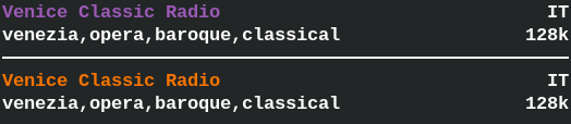
As colours started to be an important part of the visual feedback of information it became clear that a theming 'engine' was required. For example; as a way to distinguish local and remote stations bookmarked in the favourites (see fig.4).
The purpose of the Theme component is to centralise colour queries from the UI components and to facilitate changes to the global application colours. The way it is designed makes it so that UI pieces are assigned a ThemeItem_e enum which is passed to Theme which, in turn, gives back the ncurses colour id assigned to the enum.
The theming 'engine' gets its 'theme' from the ColourTheme object it is initialised with.

2.3 Language

In order to allow for any future development of multi-language support, all UI display strings were assigned a TextID_e enum and aggregated behind an interface.
Anytime the UI components requires a string for the display (e.g.: tab names, labels, etc...) it goes through the Language interface using the text(..) method.
At the moment all UI strings are hardcoded in the implementation file (Language.c) for Language.
2.4 Resizer

To deal with a terminal resize event when multiple stacked panel groups and dialogs are on screen the Resizer was created. It is basically a stack that holds references to all the opened element and their respective 'resizer' method that is responsible for repainting their elements. Any group or dialog opened is responsible for pushing and popping themselves with Resizer.
In the implementation all the window/element sizes are pre-calculated and stored in the UI component. Since UI is where everything else is spawned from, the sizes are passed individually as pointers to any relevant elements created so that, when painting/re-painting, the correct and up-to-date sizes are known.

When a resize event is detected ("KEY_RESIZE" in ncurses, a.k.a. "ACTION_RESIZE" in cTune) then the Resizer.resize() method is called. It iterates through the stack bottom-to-top and calls all the referenced 'resizer' methods. The first one is always UI and its method first calls its inner calculateWinSizes(..) method to re-calculate all the sizes based on the updated screen dimensions.
The main problem was the fact that the input was originally designed to be captured by Dialogs so made repainting anything under them a tricky problem. This is why the whole global access and stack solution was eventually envisioned and implemented. Though it took a fair amount of musing and experiments of different approaches to get to this now very obvious and simple solution!
2.5 Widgets

The whole point of widgets is to have a more understandable abstraction and UI primitives to construct the UI from.
There are two types of widgets:
- primitive - base interface elements,
- compound - more complex elements build from primitives.
Widgets are great for code reuse. In addition, all the minutia involved in creating and manipulating the elements are hidden away behind a much more descriptive interface.
Technically, dialogs are not widgets but widget-like element and, thus, do not belong in the widget hierarchy. As the distinction is not exactly earth-shattering here, I've dumped them into the same widget bag regardless.
2.5.1 ScrollWin

The way ncurses work is that it uses a sort of canvas called WINDOW which makes it easier to section off parts of the screen and manipulate these independently from each other (i.e.: edit/refresh only a section).
There is an alternative type called a pad which acts like a virtual WINDOW. It has a view-box that is used as a sort of proxy to it. Because of this, the dimensions of the pad can actually be larger than the screen (see fig.X) which makes it ideal to use when the screen size is either not known in advance or not immutable.
In fig.X, S1 and S2 are the column/row coordinates of the top left and bottom right corners of the view-box on the screen respectively. The size of the view-box is known to ncurses from subtracting one from the other. This is why only P1, is needed for the pad.
ScrollWin was made as a wrapper for a pad mainly to facilitate the whole content scrolling process and the usage of the 'pad' in general.

2.5.2 ScrollBar
After the creation of a scroll-capable window widget, scrolling indicators were a must.
Definitions:
- axis
- scrolling direction - row (y) or column (x)
- unit
- a character space on the axis
- scroll length
- the length of the pad on the axis
- scroller size
- size of scroller in units
- bar length
- size of scrollbar in units
- page
- content resulting from a unique view-box pad position on the axis
- page count
- total number of page views on the axis
- page increments
- page count - 1
- scroller position
- increment position offset of the scroller on the scrollbar
- page increment value
- value of a page as a proportion of the scrollbar size (
bar length/page count)

Because the terminal is not about pixels but rows and columns of characters, there are some adjustments required. In particular there is the 'threshold' problem. I.e.: when to initiate a scroll event. When moving the cursor on rows or columns within the boundary of the current view-box view, scrolling should not happen. But when the cursor moves to the first row or column outside the boundary then scrolling should happen as the pad shifts by 1 unit.
A scrollbar represent the entire length of the pad on the axis whereas its scroller represents the view-box and, by extension, its position on the pad. The scroller size correlates with the proportion the view-box takes over the pad on the axis. When the view-box shifts on the axis, the scroller moves as a proportion of the shift over the pad length.
There are 3 possible scenarios to consider:
- when the page count is 1 (i.e.: the size of view-box is smaller or equal to the size of the pad on the axis)
- when the page increments is smaller or equal than the bar length and,
- when the page increments is larger than the bar length.

Scenario 1 is easy as there is no scrolling so either the scroller is shown filling the bar at full length or the scroll bar is not shown.
Scenario 2 means that both the scroller size and page increment value are equal or larger than 1 unit. I.e. the scroller will move everytime the view-box shifts on the axis.
In scenario 3, the page increment value is a fraction of a unit so the scroller does not always move if the scroller position does not meet its threshold value.
Once the scrolling logic is implemented there is the matter of informing the scrollbar where the pad rests on its axis (with setPosition(..) ) so that it can calculate and update the scroller position.
Some extra features were added during development. Namely scrollbar positions (top/right/bottom/left) and a hide flag when scrolling is disabled.

2.5.3 BorderWin
The BorderWin widget serves solely to provide a frame and a title around content. The edges are 'boxed' and the title added centered at the top edge. That's it.

2.5.4 Dialog
Dialog uses 3 UI primitives: ScrollWin, BorderWin and ScrollBar and hides the complexities of creating a dialog window behind its interface.

One thing of note is the capability of auto-scrolling based on a given threshold. This was added in as a way to deal with form fields in a smaller than expected space (i.e.: form size > ScrollWin's view-box size).
To auto-scroll, the current cursor coordinates (column and row) is passed to autoScroll(..) and the scrolling position is auto-magically calculated and both the ScrollWin's view-box and ScrollBar's scroller(s) are set to the their correct values
The scrolling threshold can be specified through setAutoScrollOffset(..). This sets the offset at which the scrolling should be triggered at. This allows a margin to be kept around the cursor wherever it goes.

For example, say that a view-box's dimension is 10 rows x 15 columns, currently at the top-left corner of a large pad and the threshold offsets are 2 rows/4 columns. If the auto-scroll row/col position given is (8,11) then nothing happens. With the position of (9,14), the view-box top-left corner position shifts to (1,3) on the pad (col = (9 + 2) - 10 = 1, row = (14 + 4) - 15 = 3).
Aside from this nifty little feature, the Dialog interface includes methods to scroll by single units (up/down/left/right) and shortcuts to scroll to the edges of the pad (top/bottom/left-edge/right-edge).

2.5.5 SlideMenu
SlideMenu uses just 1 other UI primitive; ScrollBar. Any menu created using this widget is always confined within the WindowProperty given during initialisation and the scroller set automatically for each menu slides.
All items in the menu, including sub-menus and back-to-parent navigation, are set via the createMenu(..) and createMenuItem(..) interface methods. There are 3 types of menu items:
- parent: item to go back up in the menu hierarchy,
- menu: item that leads to a sub-menu,
- leaf: (actionable) item entry.
Actionable items require a callback method that executes when activated in the menu. The callback takes a SlideMenu_Item_t * argument. In order to allow custom data to be passed, an obscure data pointer can be provided when constructing a menu item which can then be accessed by the callback via the item pointer. Optionally, a callback can also be added to other types of menu items if required (e.g.: to dynamically load the sub-menu items).

The following code example demonstrates usage for creating menu content.
struct Payload {
  void * obscure_ptr;
  bool (* cb)( void * );
};

bool payloadCtrlCb( SlideMenu_Item_t * menu_item ) {
  CbPayload_t * payload = (CbPayload_t *) menu_item->data;

  if( payload == NULL || payload.obscure_ptr == NULL || payload->cb == NULL )
      return false; //EARLY RETURN

  return payload->cb( payload->obscure_ptr );
}

void createMenus( SlideMenu_t * sm, Payload * payload ) {
  //create a menu within the root menu
  SlideMenu.createMenuItem( &sm->menu.root, SLIDEMENU_MENU, "Sub-menu A", NULL, NULL );

  //get the pointer to the newly created 'sub-menu' item
  SlideMenu_Item_t * item = Vector.at( &sm->menu.root.items, 0 );

  //create and allocate the actual sub-menu inside the sub-menu item
  SlideMenu.createMenu( &item->sub_menu, item->parent_menu, item->index )

  //create item in 'sub-menu' to navigate back to the parent (root)
  SlideMenu.createMenuItem( item->sub_menu, SLIDEMENU_PARENT, "Go back", NULL, NULL );

  //create a couple of dummy items in the 'sub-menu'
  SlideMenu.createMenuItem( item->sub_menu, SLIDEMENU_LEAF, "Sub-menu item A1", NULL, NULL );
  SlideMenu.createMenuItem( item->sub_menu, SLIDEMENU_LEAF, "Sub-menu item A2", NULL, NULL );

  //create an item with an associated action in the root menu
  SlideMenu.createMenuItem( &sm->menu.root, SLIDEMENU_LEAF, "do something", payload, payloadCtrlCb );
}2.6 Master UI component

The UI component acts as a the UI's core and boundary interface similar to how Controller gate-keeps cTune's backend. It also is responsible for initialising and tearing down the UI.
Most of its interface provides methods to print information to the screen. These are used as callbacks in the Controller. The setQuietVolChangeCallback(..) method allows to set a callback for a volume change event when nothing is playing.
3. Overview
As for the backend, here's the final UI diagram. Again, for cleanliness' sake, the globally used interfaces are not connected to everything (see blue comments) and the DTOs/data-structures have not been included.

The wireframe graphics presented here are actually cleaned up versions of my original sketches that were scratched on pieces of paper.